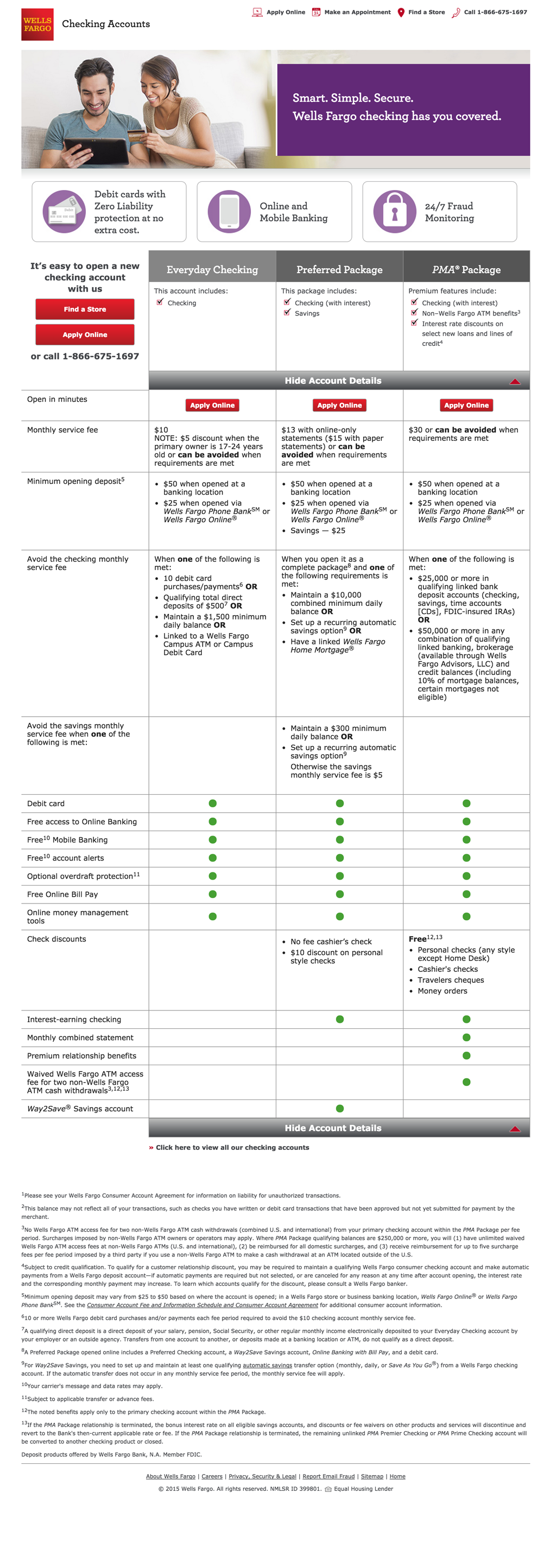
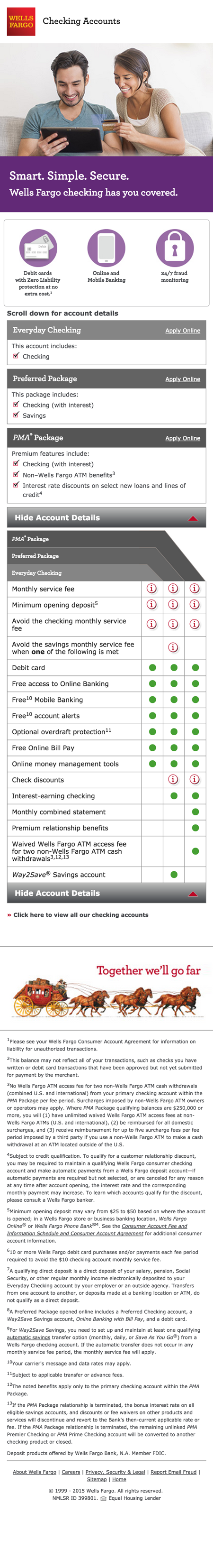
As a consultant to MRM-McCann, I was tasked with building a new Wells Fargo checking account landing page using the ZURB Foundation framework. I made recommendations to design improvements and expressed caution on some of the client's desired features of the page. The final product was made to have feature fallbacks for Internet Explorer 8 while also be mobile responsive.
One of the interesting expectations for this project was based on a legal requirement: The name of the checking account type had to always be present, even if there were visual differences in the table. That required a heavy use of fixed elements and toggling states depending on where the user was on the page. There was also the matter of hosting a lot of detailed information for almost all of the table cells, which I saw that modal windows would be the best solution as the client often would have large chunks of text on some cells.I think the most challening part was getting the fixed elements on the mobile version to line up correctly, especially because I couldn't recreate the table in CSS. I spent a lot of time with the designer working out a pixle perfect size that would also scale correctly in which ever mobile device a user might be on. There were many rounds of me working close with QA to trouble shoot particular devices.